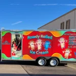
A food truck should not be designed as though every customer will see the same side first. Strong food truck graphics account for the different directions people may approach from so the brand remains recognizable whether someone arrives from a parking lot, event aisle, sidewalk, neighboring vendor, or the rear of the truck.
That matters because mobile food businesses operate in changing environments.
One day, the customer line may form along the service side. At another event, people may approach from the opposite direction before turning toward the ordering window. A truck parked at the edge of a lot may be seen first from the rear, while one positioned between other vendors may have limited visibility from only one angle.
The graphics should not depend on one perfect viewpoint.
Why Do Customer Approach Angles Matter?
Food trucks are rarely viewed like fixed storefronts.
A storefront usually has a primary façade and a relatively predictable entrance. A truck may park in many different settings, and the surrounding layout can change from one stop to the next.
Customers may first see:
• The service side
• The non-service side
• The front corner
• The rear
• A narrow angled view between neighboring vendors
• Only the upper portion of the truck above a crowd
• A partial side from across a parking lot
Those changing conditions affect how the food truck wrap design should distribute important branding.
If the only large logo appears near the ordering window, someone approaching from the opposite side may not identify the business until they walk around the truck.
A balanced design gives the brand more than one opportunity to be recognized.
Does Every Side Need the Same Logo?
No.
The logo can appear on several sides without using exactly the same scale or placement.
The service side may need to balance the logo with ordering windows, menu areas, awnings, and customer activity. The opposite side may have more uninterrupted room and support a larger visual treatment.
The rear may require a simpler version because doors, lights, handles, and other vehicle features reduce the usable area.
The goal is not perfect duplication.
It is repeated recognition.
A customer should be able to connect each side with the same food business even though the compositions differ.
Which Side Should Carry the Strongest Branding?
That depends on how the truck normally operates.
If the service side remains visible to most customers during events, it may deserve the strongest identity.
However, some trucks have more equipment, windows, and operational features on that side than usable graphic space. In that case, the opposite side may be better suited to a larger logo or more complete visual composition.
A strong design can assign different jobs to different surfaces.
For example:
• The service side can prioritize ordering-related recognition.
• The opposite side can carry a larger brand graphic.
• The rear can reinforce the logo and web address.
• The front or cab can connect the entire vehicle visually.
The brand works as a system rather than relying on one panel.
What Happens When Customers Approach From the Opposite Side?
The non-service side can be more important than it first appears.
At festivals, breweries, parking lots, and community events, people may walk behind rows of trucks or approach from a direction that initially exposes the equipment side or closed side.
If that surface contains little more than a background pattern, potential customers may not immediately understand what business they are seeing.
That does not mean the side needs a complete menu or dense list of offerings.
A recognizable company name, logo, cuisine cue, or strong branded image can establish identity before the customer reaches the ordering area.
This is one reason food truck graphics should not treat the non-service side as leftover space.
How Should Graphics Work When the Customer Line Changes Direction?
Customer lines are not always predictable.
Event organizers may place barriers, tables, seating, or neighboring vendors in ways that change how people queue.
At one location, customers may approach directly toward the serving window.
At another, the line may form parallel to the truck.
A long line can also block lower portions of the vehicle.
That creates an important design consideration: critical branding should not depend entirely on areas likely to be obscured by people standing close to the truck.
Higher graphic zones can help maintain recognition when the lower body becomes visually crowded.
This does not mean every important element should be placed near the roofline.
It means the composition should consider how crowds interact with the vehicle during active service.
Should the Rear of the Truck Carry Important Branding?
Yes, but usually in a concise form.
The rear can be one of the first surfaces people see when a truck enters an event or when they approach from another parking aisle.
On the road, it is also visible to traffic behind the vehicle.
However, rear surfaces often contain more physical interruptions than the sides.
Doors, lights, handles, license areas, hinges, vents, or other equipment may limit what can be displayed clearly.
That makes the rear better suited to a simpler composition.
A strong logo, business name, recognizable color treatment, website, or concise supporting message can reinforce the identity without overcrowding the surface.
How Should the Front and Cab Fit Into the Design?
The cab is sometimes treated separately from the food-service body, but visually it is still part of the truck.
A disconnected cab can make the vehicle feel like two different pieces.
Using consistent colors, shapes, or supporting graphics can connect the front with the rest of the wrap.
The cab may not need the same level of detail as the main body.
Instead, it can carry the visual language forward so the truck remains recognizable from front-quarter angles.
This is particularly useful when customers approach diagonally rather than directly from the side.
How Can Large Graphics Help From Multiple Angles?
Large-scale visual elements tend to survive changing viewing conditions better than small details.
A broad color field, distinctive illustration, or recognizable logo shape can still be understood when only part of the truck is visible.
Small service lists, longer taglines, or detailed menu text are more dependent on close viewing.
That means large graphic elements can help tie the truck together while detailed information stays where customers are most likely to read it.
The result is a layered hierarchy.
People recognize the business first.
They process more detailed information as they move closer.
Should Food Photography Appear on More Than One Side?
It can, but repetition should be intentional.
Using the exact same photograph at the same size everywhere may make the wrap feel repetitive.
Different surfaces may benefit from different image crops or compositions.
For example, the non-service side might support a large food image because it has more uninterrupted space.
The service side may use smaller food imagery because menus and windows occupy more of the visual field.
The images should still share a consistent style.
Lighting, color treatment, quality, and composition should feel like parts of the same brand.
How Does Viewing Distance Change the Design?
Someone across a parking lot sees the truck differently from someone standing at the ordering window.
At longer distances, broad visual elements matter more.
Closer viewers can process secondary information.
This creates a practical hierarchy:
Long-Distance Recognition
Logo, color, truck name, and large imagery.
Mid-Range Recognition
Cuisine cues, web address, selected supporting message.
Close-Range Information
Menu details, pickup instructions, QR codes, or other small content where appropriate.
Not every side needs all three levels.
The design should assign information according to where and how people are likely to encounter that surface.
What About Trucks Parked Between Other Vendors?
Crowded events can restrict viewing angles considerably.
A neighboring truck, tent, sign, or line of customers may block most of one side.
In those situations, upper portions of the wrap and corner transitions can become more important.
A brand identity that exists only at the center of one panel may disappear behind another vendor setup.
Graphics distributed across multiple surfaces create more chances for recognition.
This is not about covering every inch.
It is about avoiding a single point of failure in the design.
Can Vehicle Graphics Continue Around Corners?
Yes.
Certain graphic elements can visually transition around corners and help the truck feel cohesive.
Colors, patterns, stripes, or larger supporting imagery can often move from one side to another.
Text usually requires more caution.
A business name or phone number positioned directly through a sharp corner may become difficult to read because part of the message sits on a different viewing plane.
This is where vehicle graphics benefit from separating flexible decorative elements from high-priority information.
The background can wrap around the truck more freely.
Critical text should remain readable from its intended viewing position.
How Do Windows and Equipment Affect Multi-Angle Branding?
Operational features can interrupt the visual connection between sides.
Food trucks may contain service windows, vents, access doors, utility panels, lighting, handles, and other hardware.
Fast-Trac’s broader vehicle-wrap content notes that food trucks have these kinds of functional interruptions and that the wrap design should account for how the vehicle is actually used.
That becomes especially important when designing for several customer approaches.
A logo that is perfectly visible from one angle may fall partly behind an awning support from another.
A large image may look balanced from the side but appear fragmented when seen from the rear quarter.
The layout should be evaluated as a three-dimensional vehicle rather than a collection of flat rectangles.
Should Both Sides Carry the Same Contact Information?
They can, but repeating information should serve a purpose.
A website or social handle may be useful on both major sides because customers can approach from either direction.
A phone number may also make sense if it is part of the business’s established contact strategy.
However, several contact methods repeated on every surface can add unnecessary clutter.
The business identity should remain dominant.
Contact details support it.
How Can Custom Vehicle Wraps Maintain One Identity Across Different Surfaces?
Consistency comes from the visual system rather than identical layout.
Custom vehicle wraps can connect all sides of a food truck through:
• Core brand colors
• Typography
• Logo treatment
• Illustration style
• Photography style
• Graphic shapes
• Message hierarchy
The exact location of those elements can change.
The service side may be more functional.
The non-service side may be more visual.
The rear may be simplified.
The cab may carry only selected brand elements.
Together, they still form one vehicle.
What If the Truck Changes Parking Orientation?
This is common for mobile businesses.
One venue may require the service window to face a sidewalk.
Another may position the truck with the same side toward a building.
A festival may place trucks in a circle or row.
A private event may assign a parking space with little flexibility.
That unpredictability strengthens the case for multi-side recognition.
Businesses exploring food truck wraps for Buckeye operations can benefit from planning the vehicle so its brand remains identifiable even when the ideal display side is not the first one customers see.
The truck should adapt visually to changing parking environments rather than depend on one perfect orientation.
How Can a Design Avoid Becoming Too Repetitive?
Repeated branding does not require repeated artwork.
A truck can show the same company name several times while changing the surrounding composition.
One side might combine the logo with photography.
Another may pair it with a graphic pattern.
The rear may use a simplified logo treatment.
The cab could use only the main colors and a supporting mark.
These variations keep the vehicle interesting while maintaining recognition.
The brand stays consistent even though the layout changes.
Should Menu Information Appear on Multiple Sides?
Usually, the menu should be placed where customers can reasonably read it during ordering.
Fast-Trac already has dedicated content on menu placement, so a multi-angle branding strategy does not need to turn every side into another menu board.
Instead, non-service surfaces can focus on recognition and supporting information.
Someone approaching from the opposite side needs to know what business they are seeing.
They do not necessarily need to read every menu item before reaching the ordering area.
This separation keeps the graphics clearer.
How Does Customer Flow Affect the Pickup Side?
Some trucks use one window for both ordering and pickup.
Others divide those functions.
When customers collect food from a separate area, that portion of the truck becomes another active viewing zone.
The graphics around it should still feel connected to the primary ordering area.
However, the messaging can change according to the function.
Brand identity can remain consistent while operational information becomes more specific.
This prevents the truck from looking like two separate businesses simply because customers interact with it in two places.
What Should Be Considered Before the Design Starts?
Useful project information includes:
• Vehicle year, make, and model
• Service-window location
• Menu placement
• Equipment and access doors
• Typical parking orientation
• Customer-flow patterns
• Major viewing directions
• Existing brand assets
• Current vehicle photos
Fast-Trac’s current vehicle-wrap process requests photos of each side of the vehicle, which reflects the importance of understanding the complete vehicle rather than designing from one elevation alone.
The purpose is not to make the owner design the truck themselves.
It is to give the graphics professional enough real-world context to create a layout that fits how the truck will operate.
Food Truck Branding Should Work Before Customers Reach the Window
A food truck’s visual identity starts working before someone reaches the ordering area.
Customers may first encounter the rear, the opposite side, a front corner, or only part of the truck through a crowd.
A strong design gives the brand multiple opportunities to be recognized.
The service side can support ordering and customer interaction. The opposite side can provide broader brand visibility. The rear can reinforce the identity. The cab can visually connect the whole vehicle.
Those surfaces do not need identical graphics.
They need a shared visual language and clear priorities.
For food truck operators in Buckeye and other mobile-service markets, planning around several customer approach angles can make the vehicle more adaptable to different parking layouts, events, and service environments without overcrowding the design or relying on one ideal viewing position.